If I handed you two identical capsules and told you one was for sleep, which one would you choose?
One is blue.
One is bright pink.
I suspect we have already lost a few votes for pink.
This is ridiculous, of course. A color cannot sedate you.
Except researchers once gave people blue and pink capsules containing absolutely nothing medicinal, and the people taking the blue ones were much more likely to report feeling sleepy.
Which raises an uncomfortable question.
How much of what a medicine seems to do begins before the medicine has done anything at all?
The blue pill contained nothing
In 1972, researchers gave 56 medical students either blue or pink capsules.
The students had been told they might receive a stimulant or a sedative.
They received neither.
Every capsule was a placebo.
Still, the color appeared to matter.
Among people given the blue capsules, 72 percent reported feeling drowsier. Among those given pink capsules, it was 37 percent.
72% vs. 37%
Same inactive capsule. Different color. Very different reports of drowsiness.
The participants were medical students, which makes this simultaneously more reassuring and less reassuring.
They knew what drugs were.
Their brains apparently knew what blue meant.
And blue meant: perhaps we should lie down.
The capsule had no sedative in it.
It did, however, have excellent branding.
We seem to have assigned jobs to colors
Later research has repeatedly found that people carry surprisingly specific ideas about what differently colored pills ought to do.
Red tends to look stimulating.
Blue tends to look calming.
White has been associated with pain relief and purity.
Green can suggest health or tranquility.
Yellow and orange often read as energetic.
Nobody sat us down as children and handed out the pharmaceutical color wheel.
RED: pep.
BLUE: bedtime.
WHITE: headache.
And yet some version of it appears to exist.
The associations are not universal. Culture, experience, geography and the medications we have encountered before all matter. But across studies, people repeatedly infer something about a pill from what it looks like before they know what is inside it.
Which is interesting because medicine is supposed to be the category where packaging matters least.
You can argue about whether a handbag looks expensive. Amoxicillin has a considerably more objective job description.
And still the brain notices the outfit.
The pill has started working before you swallow it
Not chemically.
That distinction matters.
A blue tablet does not contain an invisible extra milligram of sleep.
But taking medicine is not just a chemical event. It is also an experience involving expectation.
You see the pill. You recognize it. You remember what you were told it would do. You decide whether it looks serious, strong, familiar, suspicious, calming or vaguely like something your grandmother used to keep beside the sink.
Then you swallow it.
By the time the active ingredient enters the story, your brain has already written the opening paragraph.
Researchers call some of this the placebo effect, but I almost dislike the term because it can sound like a polite way of saying, you imagined it.
That is not quite what is happening.
Expectation can affect how people perceive subjective experiences such as pain, nausea, alertness and drowsiness. The sensation can be perfectly real even when part of what shaped it came from the context surrounding the treatment.
The body gets the molecule.
The brain gets the whole presentation.
And apparently it reads the packaging.
This gets considerably less cute when the medicine is real
Here is the part I did not know.
Generic versions of the same prescription medicine can sometimes arrive looking different because they were made by different manufacturers.
Same active drug.
Same strength.
New color.
Researchers studying antiepileptic medications looked at what happened when patients’ pills unexpectedly changed appearance.
They examined tens of thousands of prescription refills and found that a recent color change was associated with greater odds that a patient would interrupt the medication.
For people with a diagnosed seizure disorder, the association was even stronger.
This does not prove someone opened the bottle, saw a blue pill instead of a white one and dramatically announced, Absolutely not.
It was an observational study, and the absolute difference was small.
But think about how many people identify medications.
Not by reciting the active ingredient.
Not by inspecting the manufacturer.
By looking at the pill.
The little white one in the morning.
The round blue one at night.
If that familiar object suddenly changes, the medicine may be pharmacologically equivalent while psychologically feeling like the wrong medicine.
That is a remarkable problem.
The color did not make the drug stop working.
It may have made the drug stop looking trustworthy.
Which makes pill color a surprisingly good design problem
We tend to think of drug design as chemistry.
Obviously, most of it is.
But once a medicine leaves the laboratory, humans have to recognize it, trust it, remember it and actually take it.
Appearance suddenly becomes part of the system.
This is why the interesting question is not:
Can a blue pill actually make you sleep?
The answer is not simply yes.
The better question is:
Can a blue pill change what you expect to feel—and therefore what you notice?
There, the answer becomes much more interesting.
Yes.
Sometimes.
And apparently enough that researchers, regulators and pharmaceutical companies have reason to care.
THE SAME BRAIN READ THE WINE LIST
This is the part I cannot stop noticing.
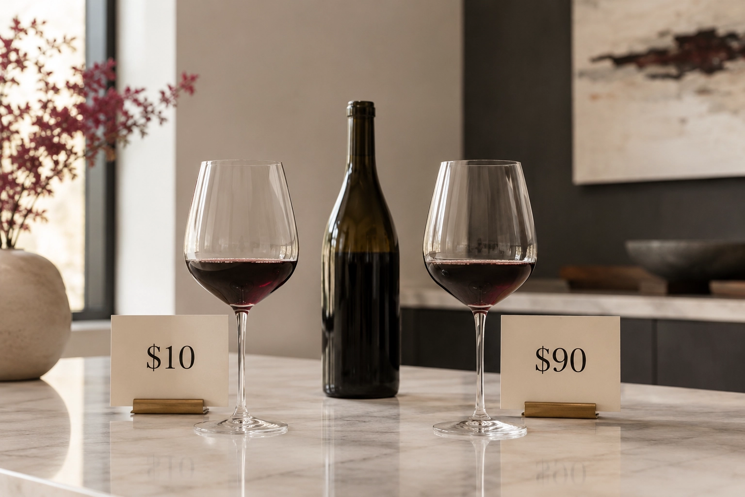
Give someone the exact same wine and tell them one glass costs $10 and the other costs $90, and the expensive one can become more pleasurable.
Give someone an inactive capsule in a different color, and it can change what they expect to feel.
Different products. Same troublesome little brain.
It keeps taking information that is supposedly around the experience and allowing it into the experience.
Price.
Color.
Packaging.
Story.
Setting.
None of these changes the underlying molecule or liquid.
They change what the brain thinks is about to happen.
And then, sometimes, what happens feels different.
Maybe there is no such thing as “just packaging”
This is where the story becomes much bigger than pills.
We like to divide products into two neat piles.
There is the real thing: the formula, ingredients, materials, workmanship.
Then there is all the marketing stuff around it: color, label, price, story, presentation.
One is substance.
The other is supposedly decoration.
Our brains seem less interested in maintaining that distinction.
If the red label tells us energy, the $90 price tells us quality or Pia tells us why the button on a Chanel jacket deserves a second look, those cues can change what receives our attention and what we expect to experience next.
That does not mean the product underneath does not matter.
Quite the opposite.
It means we should be more precise about what we are responding to.
Sometimes a beautiful story helps us notice craftsmanship that was there all along.
Sometimes a high price makes an unchanged wine seem better.
And sometimes an entirely inactive blue capsule manages to make a room full of medical students sleepy.
The brain, apparently, is willing to review the packaging before it has read the ingredients.
So does the color of a pill change how well it works?
If by works we mean the pharmacological action of an active ingredient, there is no reason to believe simply changing a pill from pink to blue makes the drug chemically stronger.
If we mean how we expect it to work, how we interpret what we feel, how familiar and trustworthy it looks, and perhaps even whether we keep taking it, color can matter.
That distinction is the whole story.
The pill has chemistry.
It also has context.
We swallow both.
Quick: which pill would you pick?
Do this before thinking too hard.
FOR SLEEP
Red / Blue / Yellow / White
FOR ENERGY
Green / Red / Blue / White
FOR A HEADACHE
Black / Orange / White / Pink
FOR SOMETHING “NATURAL”
Green / Red / Purple / White
There are no medically correct answers.
That is the point.
If one color immediately felt more appropriate than another, your brain has already attached meaning to an ingredient list it has never seen.
My prescription suddenly looks different. Now what?
A change in color, shape or size does not automatically mean the pharmacy gave you the wrong medicine. Approved generics can look different while containing the same active ingredient and strength.
But do not identify medication by color alone.
If a refill looks unexpectedly different, check the imprint and label and ask the pharmacist to confirm it before taking it rather than guessing—or simply stopping the medication.
What this does not prove
It does not mean placebos can replace effective medical treatment.
It does not mean blue pills make everyone sleepy or red pills make everyone energetic.
It does not establish that color reliably changes objective clinical outcomes.
And it does not answer separate questions about the ingredients used to color a particular medication.
What the research does show is stranger and more useful:
The appearance of medicine can influence what we expect from it, what we report feeling and, in some circumstances, how we behave toward it.
Sources + Methodology
Blackwell, Bloomfield and Buncher, 1972. Researchers gave 56 medical students one or two blue or pink placebo capsules while leading them to expect either stimulant or sedative effects. Thirty percent reported drug-related changes. In later systematic reporting of the study, 72 percent of participants receiving blue capsules reported increased drowsiness versus 37 percent receiving pink capsules. Two capsules also produced stronger reported effects than one. It was a small historical experiment involving healthy medical students and subjective responses, so the exact percentages should not be generalized to all patients or medications.
De Craen, Roos, de Vries and Kleijnen, 1996. A systematic review examined the relationship between medicine color and perceived or measured effects. Across perception studies, red, yellow and orange were commonly associated with stimulation, while blue and green were associated with calming effects. Clinical studies testing whether color changed treatment effectiveness were much less consistent, an important distinction between expectation and demonstrated efficacy.
Amawi and Murdoch, 2022. Survey research found recurring associations between pill colors and expected purposes or effects, including particularly strong associations between white and pain relief and red and stimulant effects. The study examined expectation rather than pharmacological outcomes and also found variation across groups, reinforcing that these associations are learned rather than universal biological rules.
Kesselheim and colleagues, 2013. Researchers studied prescription claims involving antiepileptic drugs and found that changes in pill color were associated with higher odds of refill interruption. Because this was an observational study, it cannot prove that the appearance change caused patients to stop taking their medication. The absolute difference was also small. Its importance is in showing that apparently superficial changes in medication appearance may influence real-world adherence behavior.
FDA guidance on generic drugs. The FDA notes that approved generic medicines may differ from their brand-name counterparts or other generic versions in characteristics including color, shape and inactive ingredients while meeting requirements for the same active ingredient, strength and clinical performance. Patients who receive a pill that looks unexpectedly different should verify it with their pharmacist rather than relying on appearance alone.