I started noticing it in the grocery store.
The foods that would like me to believe they are healthy all seem to have attended the same branding meeting.
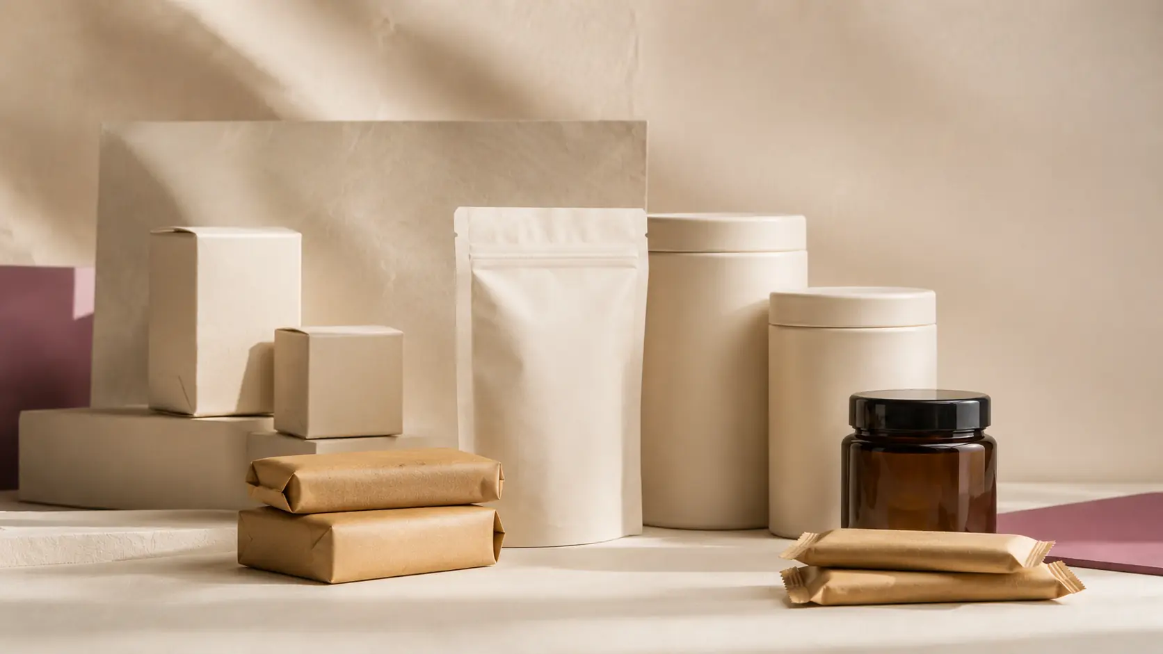
Beige.
Cream.
A tasteful little sage green.
Maybe some kraft paper.
The typography is restrained. The illustrations look hand-drawn. The bag is matte instead of shiny. There may be a tiny transparent window so I can admire an oat.
Nothing yells.
Nothing sparkles.
Nobody appears to be having too much fun.
Once you see the uniform, it is very difficult to stop seeing it.
Walk through the cereal aisle and compare the brightly colored boxes we grew up with to the newer premium granolas. Look at crackers. Protein bars. Plant milks. Kids' snacks. Pasta. Rice.
The traditional package says:
LOOK AT ME. I AM DELICIOUS.
The new healthy-looking package seems to whisper:
I compost.
I have spent enough of my life thinking about positioning and consumer behavior to know that none of this is accidental. But I wanted to know whether this was simply a very successful mood board—or whether the packaging actually changes what we believe about the food.
It does.
Researchers ran seven studies examining what they called au naturel packaging colors—the muted beiges and earth tones that resemble colors found in nature.
In one experiment, people were shown rice in either a beige package or a red one.
That is a fairly expensive shade of beige.
More interestingly, the researchers found that these natural-looking colors could increase perceived authenticity and, for foods people already considered healthy, increase willingness to pay.
But beige didn't perform this trick universally.
When the researchers tested butter, the difference wasn't statistically meaningful.
Which is useful.
The finding isn't beige = healthy.
It's that beige can help complete a story we are already prepared to believe.
And color isn't working alone.
Researchers studying minimalist packaging examined 1,353 supermarket packages and followed that work with six preregistered studies.
They found that simpler package designs can lead us to assume the food contains fewer ingredients. Fewer ingredients can then become greater perceived purity—and greater perceived purity can increase what we're willing to pay.
The package didn't actually remove an ingredient.
It removed visual clutter.
Our brains handled the rest.
Then there is the material itself.
Paper. Cardboard. Brown fiber. Matte surfaces.
Things that look as though they may have once known a tree.
Across five studies, researchers found that people perceived food in paper packaging as healthier than food in plastic packaging. In some of the experiments, the paper packaging even activated a health goal strongly enough to affect how much people ate.
The food hadn't changed.
The thing wrapped around it had.
Other research has found that green packaging can increase perceived healthiness, while cardboard can increase perceptions of sustainability and price.
Which brings us back to the grocery store.
Because we rarely encounter one of these signals by itself.
We get the whole costume.
The muted color.
The matte bag.
The kraft-paper texture.
The tiny type.
The generous empty space.
The carefully imperfect little illustration.
The window showing us something reassuringly brown and irregular.
Individually, none of those things tells us whether a food is nutritious.
Together, they can make something feel wholesome before we've learned almost anything about what is inside it.
And this is where I think the distinction matters.
Because none of this means the food is bad.
Some of the products wearing the healthy uniform really are excellent. They may contain ingredients we prefer. They may have more fiber, less added sugar, better sourcing or genuinely thoughtful formulations.
The problem isn't necessarily that the package is lying.
Sometimes we finish the sentence for it.
Beige becomes natural.
Natural becomes healthy.
Minimal becomes pure.
Paper becomes wholesome.
A little green leaf somehow starts submitting evidence.
It isn't evidence.
It's packaging.
Very good packaging, actually.
And despite knowing all of this, I am not immune.
I have absolutely stood in a grocery store holding two nearly identical products and felt inexplicably more virtuous about the one that looked as though it had been packaged in Copenhagen.
That is precisely why I find this worth knowing.
Marketing works best when it doesn't feel like marketing.
The old version often made itself fairly obvious.
Bright colors. Giant logos. Cartoon characters. Starbursts. Exclamation points.
The newer version can be much more elegant.
It doesn't have to tell us:
THIS IS HEALTHY.
Sometimes it simply dresses like something healthy would dress.
So the next time something in the grocery aisle catches your eye because it looks unusually wholesome, don't necessarily put it back.
Just notice what happened.
Before reading the nutrition panel.
Before checking the ingredients.
Before deciding what you think of the food itself.
Ask yourself two questions:
What do I actually know about this food?
And what did the package just make me feel like I know?
Because health has a dress code.
And beige is having an excellent year.
Sources + Methodology
This article draws primarily on peer-reviewed experimental research examining how packaging color, visual simplicity and packaging material affect consumer perceptions and behavior.
These studies do not establish that beige, green, paper or minimalist packaging makes every product appear healthier. They also do not establish whether the food inside any particular package is actually healthy.
They establish something narrower—and more interesting for our purposes: visual characteristics of a package can influence what consumers infer about the product before the underlying food has changed.
Marozzo, V., Raimondo, M. A., Miceli, G. N., & Scopelliti, I.
“Effects of au naturel packaging colors on willingness to pay for healthy food.” Psychology & Marketing, 2020. Seven-study research program examining natural-looking packaging colors, perceived authenticity and willingness to pay. Includes the beige-versus-red rice experiment discussed above. DOI: 10.1002/mar.21294.
Ton, L. A. N., Smith, R. K., & Sevilla, J.
“Symbolically Simple: How Simple Packaging Design Influences Willingness to Pay for Consumable Products.” Journal of Marketing, 2024. Field analysis of 1,353 supermarket packages followed by six preregistered studies examining simple packaging, inferred ingredient count, perceived purity and willingness to pay. DOI: 10.1177/00222429231192049.
De Temmerman, J., Vermeir, I., & Slabbinck, H.
“Eating out of paper versus plastic: The effect of packaging material on consumption.” Food Quality and Preference, 2023. Five studies examining paper versus plastic packaging, perceived healthiness, health-goal activation and consumption. DOI: 10.1016/j.foodqual.2023.105023.
Food and Humanity, 2024.
“The influence of material and color of food packaging on consumers' perception and consumption willingness.” Research examining packaging color and material, including effects of green packaging on perceived healthiness and cardboard on sustainability and price perceptions. DOI: 10.1016/j.foohum.2024.100265.